


About Me

I got here the long way round. High school me was already obsessed with architectural blueprints and floor plans, so design was always in the cards. I just took a very scenic route to figure out exactly what kind.

There was a translation degree that felt like wearing someone else's shoes. A stint at a telecom company that taught me more about human frustration than any textbook ever could. And then three years at a metal working company modelling metal structures in 2D and 3D, where I quietly discovered I had a thing for making complicated things feel simple and logical. Turns out that skill never really left me.

After that, things got interesting. Construction sites, high-pressure clients, real conversations with real stakes. I was an account manager and the thing I did the most was actually listening. And that's where I had the thought that changed everything: I love figuring out what people need. I just didn't love the selling part.

So I made the call. Walked away from sales and went all in on the thing that had been pulling at me for years. UX/UI Design. It felt like finally speaking my first language. Everything clicked. A year between two specialisations later, I had the vocabulary, the tools, and the obsession to match.

Since then I've been doing the real thing. At a startup incubator I dug into usability problems in their website, messy, ambiguous, exactly the kind of work I thrive in. Then I became the sole designer at a B2B SaaS platform, owning the entire design process from the very first research question to the final shipped product. No safety net. No hand-holding. Just me, the problem, and the work.
My background is all over the place, and I wouldn't change a thing. Every detour gave me something. I know how to listen deeply, ask the questions others skip, and translate messy human needs into design that actually solves something. If you're looking for someone who gets both the people side and the craft side, let's talk.

Filipa's Town
Website
Work Type
Stack


Where it all began
Portfolios are boring. Most of them look the same, feel the same, and are forgotten the moment you close the tab.
I didn't want that. I wanted mine to feel like me, someone who takes design seriously but doesn't take herself too seriously.
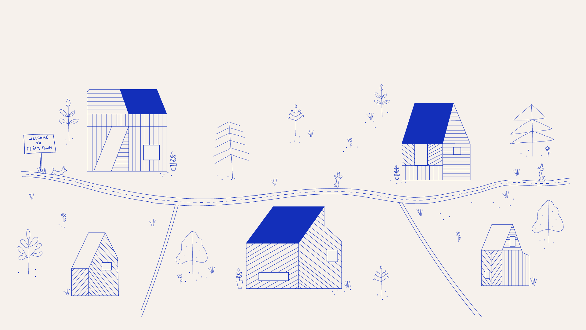
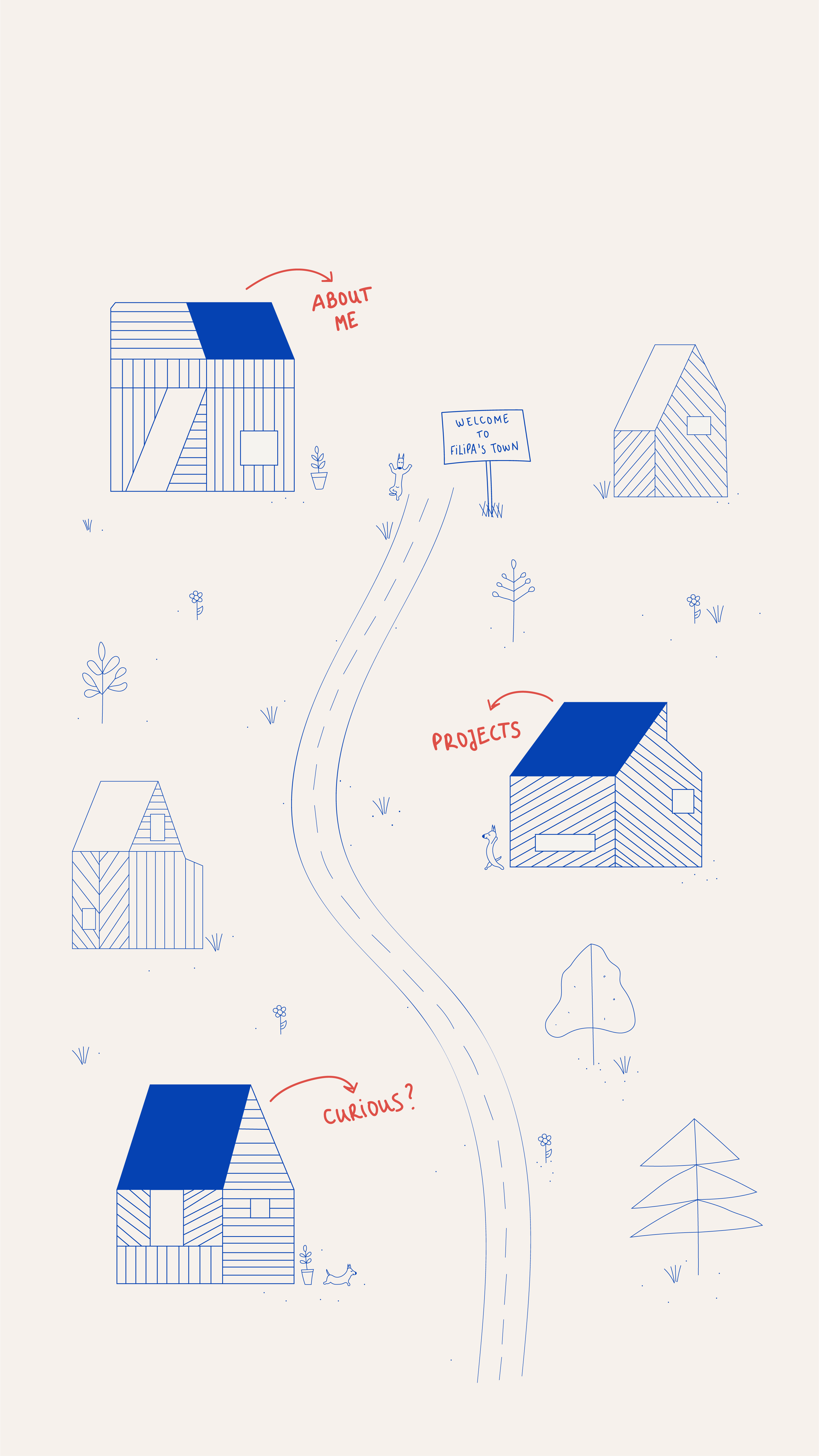
So instead of a grid of projects and a contact form, I built a town.

The mission
Three things I needed to nail:
Show that I can design and develop. Stand out without being confusing. And make sure a recruiter with 30 seconds to spare could still find what they needed.
That last one was the real challenge, because a creative concept that sacrifices usability isn't clever, it's just annoying.

From chaos to clarity
I looked at a lot of portfolios. Minimal ones, wild ones, everything in between. Most of the impressive ones had a problem: they were impressive for about ten seconds, then impossible to use.
That was my north star. The town metaphor only works if it feels obvious the moment you land on it. No tutorial needed, no figuring it out, just explore.
Early sketches were messy (as they should be), but they helped me lock in the core idea: houses as entry points for each section, About Me, Works, Curious, and interaction that follows spatial logic people already understand.

Mapping the journey
The navigation runs on a custom illustrated background used as an image map. Houses with blue rooftops are clickable hotspots. Each one opens a modal with the right content for that "place."
Simple in concept. Less simple to execute well.
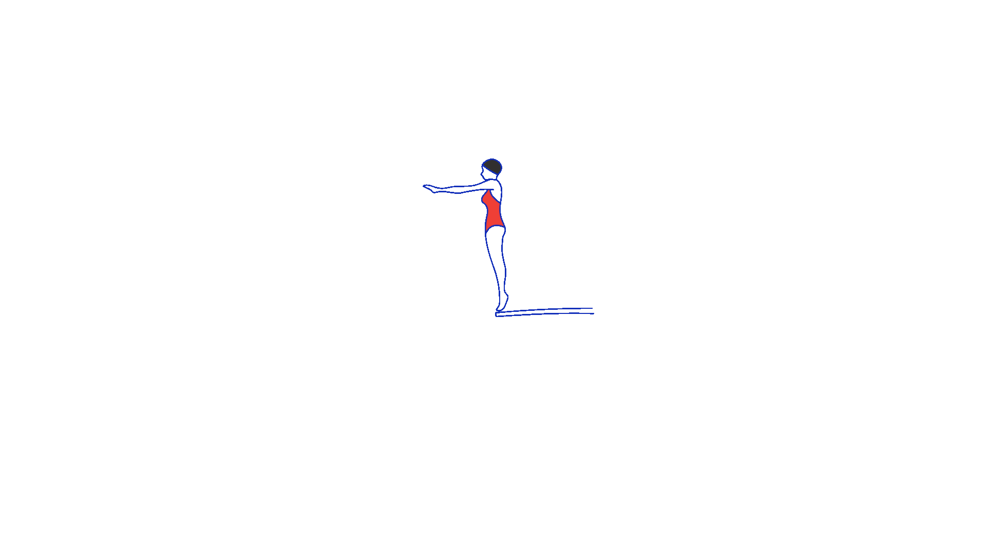
I tested the flows with people who had never seen an image map before, refined until nothing needed explaining, and added two small details that make a big difference: buttons written in my own handwriting (yes, really) and a loading animation I made in Illustrator and After Effects, a nod to my background in swimming that sets the tone before the town even appears.

Giving shape to the vision
Everything here is custom. The illustration, the UI, the code.
I drew the background in Adobe Illustrator, two versions, one horizontal for desktop, one vertical for mobile, so the spatial logic stayed intact across screen sizes. Then I built the site in HTML, CSS, Bootstrap and JavaScript, with a UI Kit to keep things consistent as the project grew.
The tone of voice got the same treatment. Playful where it could be, clear where it needed to be. The contact section has personality, but it still tells you exactly what to do next.

Where design meets development
Being the designer and the developer on something like this is both a superpower and a trap.
Every design choice is also a technical decision. The modal system, for example, keeping each one anchored to the right hotspot as the window resizes took more passes than I'd like to admit. Accessibility was built in from the start, not added at the end: a widget that lets users enable and exit accessibility mode whenever they want.
The iteration loop was fast and a little chaotic. Exactly how it should be.

From vision to reality
The result is a portfolio that does what most portfolios don't: it shows personality before you've read a single word.
Navigation is spatial but intuitive. Calls to action are where they should be. It works on your phone. And somewhere in there, there's a swimming pool.

The impact
It worked.
More interviews. Better conversations. Recruiters and hiring managers who reached out specifically because the portfolio stuck with them, and that almost never happens.
What I'm most proud of isn't the concept though. It's that the feedback was always about two things together: how original it is and how easy it is to use. That balance was the whole point.
Music to my ears
"Phenomenal portfolio, clear, concise and most of all, creative!"
"Parabéns pelo teu site, muito interessante :)"
"Parabéns, Filipa! Adorei o teu site :)"

My Vodafone App
Mobile App
Work Type
Stack

Where it all began
We were already My Vodafone app users before this project started. We knew the app, we used it regularly, and honestly, we found it frustrating on a regular basis too.
Too much information on screen at once. Simple tasks hidden behind too many taps. A dashboard that showed everything except what you actually needed right now.
So when the opportunity came to redesign it, it felt personal. Because it was.

The mission
Not a full reinvention, just making the app work the way it should have from the start.
The focus was on three things: surface what users actually care about (data, balance, bills), make the most common tasks faster and less confusing, and modernise the look without losing what makes Vodafone recognisable.
Simpler. Cleaner. Less "where is that again?"

From chaos to clarity
We already had opinions going in, but opinions aren't research, so we did the work.
Talking to other users confirmed we weren't special cases. "I just want to quickly see my data left, but I always get lost" came up more than once, in different words. A heuristic evaluation using Nielsen's principles put numbers to what people were feeling: poor visibility of system status, inconsistency across screens, not enough error prevention.
Competitor analysis filled in the rest. Other telecom apps were doing some things noticeably better: clearer usage graphs, smarter information hierarchy, add-on flows that didn't require a tutorial.
The conclusion was the same everywhere we looked: simpler, clearer, more consistent.

Mapping the journey
We mapped the flows we knew were broken, paying a bill, checking a plan, finding usage details, and redesigned them from the user's perspective, which was easy, because we were the users.
Paying a bill went from a confusing multi-step process to a clear 3-step flow. The dashboard became a hub: data usage, balance, billing alerts, all visible immediately, with the option to personalise it based on what you use most.
Every wireframe came with the same question: if I landed here right now, could I find what I need without thinking about it?

Giving shape to the vision
A UI Kit brought everything together: Vodafone red as the anchor, balanced with neutral tones so the screen didn't feel like an emergency, reusable components to keep things consistent across every flow.
High-fidelity mockups showed what the app could feel like when hierarchy is respected and clutter is gone. Lighter. More confident. Something you'd actually open without sighing first.

Testing the design
Once the prototype was ready, we ran usability tests with three core tasks: viewing and paying the December invoice, checking active services, and adding a new mobile service.
The results were useful in the best way: specific, actionable, a little humbling.
The Services screen had two clear problems: icons without labels left users guessing, and secondary options placed below the active services section were pulling attention away from content that mattered more. Small things, but the kind of small things that add up to "this app is confusing."
We fixed both. Better labels, stronger hierarchy, clearer visual flow. The kind of iteration that only happens when you actually watch people use what you built.

From vision to reality
The redesigned app surfaces what matters instantly. Core tasks are faster. The UI is consistent without being rigid. And the dashboard finally feels like a dashboard, not a checklist of everything the app can do.

The impact
This one meant more than most projects because the starting point was real frustration, not a brief.
Solving something you've personally struggled with, then validating that solution with research and testing, is a different kind of satisfaction. It also builds a different kind of confidence: in your instincts as a user, and in your ability to turn those instincts into something that works for a lot of other people too.
It's one of the projects I'm most proud to show, not because of how it looks, but because of everything that went into getting there.

Founders Founders (F2)
Website Redesign
Work Type
Stack

Where it all began
Founders Founders supports entrepreneurs and startups through incubation programs, community initiatives and workspace services.
When I joined during my internship, the website didn't reflect any of that. Broken buttons, navigation that went nowhere, key services buried where no one would look. The company had something genuinely valuable to offer and the website was the last place you'd figure that out.
It wasn't a visual problem. It was a structural one.

The mission
Turn the website from a digital placeholder into something that actually worked: bringing in the right people, communicating the right things, and making it easy to take the next step.
Not just a prettier website. A more useful one.

From chaos to clarity
Before touching anything, I needed to understand what was broken and why.
I audited the existing site, mapped where things fell apart, and looked at what competitors were doing. Most had decent navigation but none of them made their unique programs feel like the main event. That gap was the opportunity.
User personas kept decisions grounded in real motivations, mostly founders and startup teams actively looking for incubation support, so nothing was designed in the abstract.

Designing the user's path
I ran a card sorting activity with stakeholders and potential users to figure out how the content should actually be organised.
It's one of those exercises that always surfaces something unexpected. What the business thinks is important and what users go looking for first aren't always the same thing. The goal was to find the structure that worked for both.
The result was a cleaner sitemap where the incubation program, services and community had the prominence they deserved. Wireframes followed: consistent layouts, clear hierarchy, calls-to-action placed where people would actually see them.

Giving shape to the vision
The visual layer was being handled by the graphic design team, so my scope was the structure underneath it.
What I delivered were implementation-ready wireframes: detailed enough to communicate layout logic and conversion intent, flexible enough to receive the visual identity on top without losing the structure underneath.
The foundation was the deliverable. And foundations only matter if what gets built on them holds up.

From vision to implementation
A few months after my internship ended, the website went live based on the wireframes and architecture I had delivered.
I wasn't there for the final visual execution, but the implemented site followed the structural decisions from the UX phase. Which was the whole point.

The impact
After the update, the incubation program reached full capacity, new scaleups joined the community, and a second edition is already being launched.
Better structure and visibility for the right services turned a static website into something that actually drove growth.
This project taught me something I haven't forgotten: you don't need to own the final product to have a real impact on the outcome. Strong UX foundations show up in the results whether or not your name is on the last file.
CURIOUS?
So you made it to the end of town.
Got a role that needs someone who thinks in systems and builds in pixels? A project that's been stuck on "almost there" for too long? Or just want to talk design with someone who actually gets it?
Fair warning: I notice bad UX everywhere, door handles, elevator buttons, supermarket self-checkouts. It's not a hobby, it's a condition.
Either way, let's make something happen.